 Brand Identity
Driving Over 30% YoY Revenue in the First Month for MSP Clarity.
Introduction
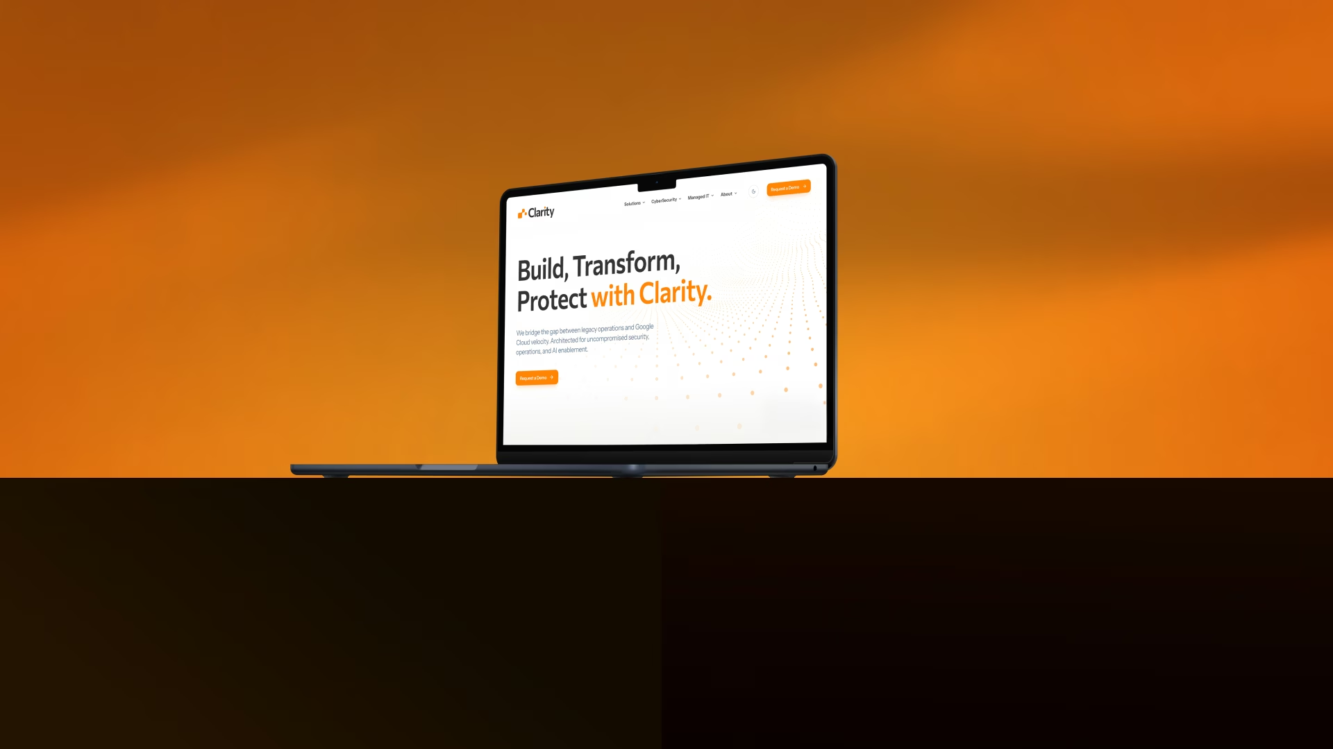
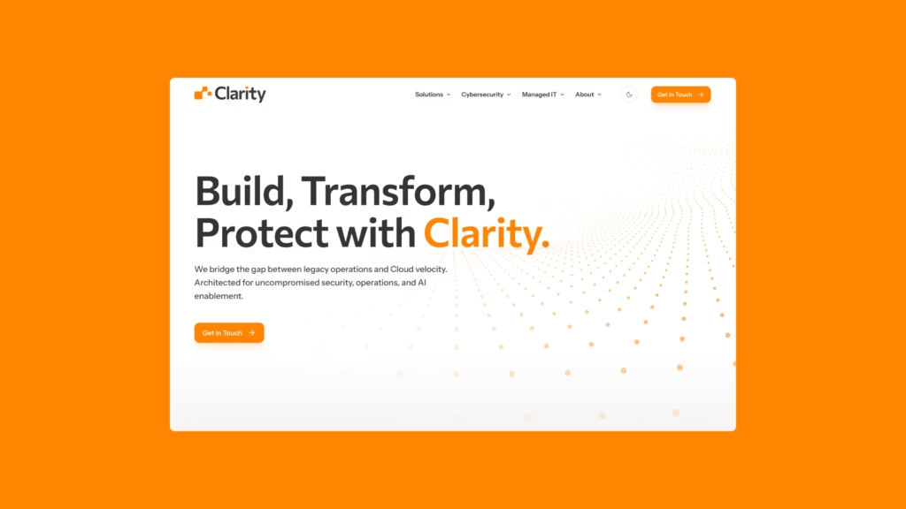
Clarity approached The Liminals for a complete rebrand—one that would move them beyond a fragmented, “strung-together” identity toward something authoritative and definitive. With a ballooning ecosystem of mismatched assets, the goal was to build a scalable foundation that reflected the enterprise-level heights they reached following a strategic Google Cloud partnership.


Brand Identity
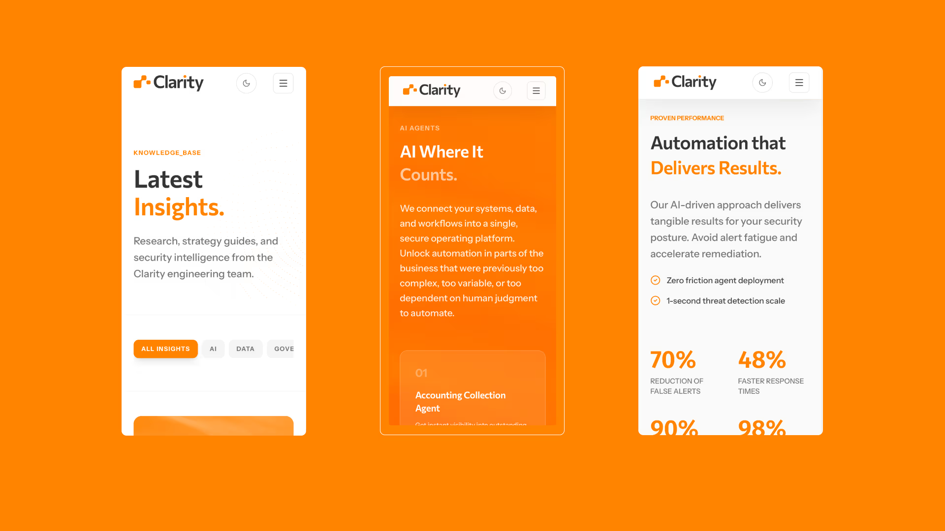
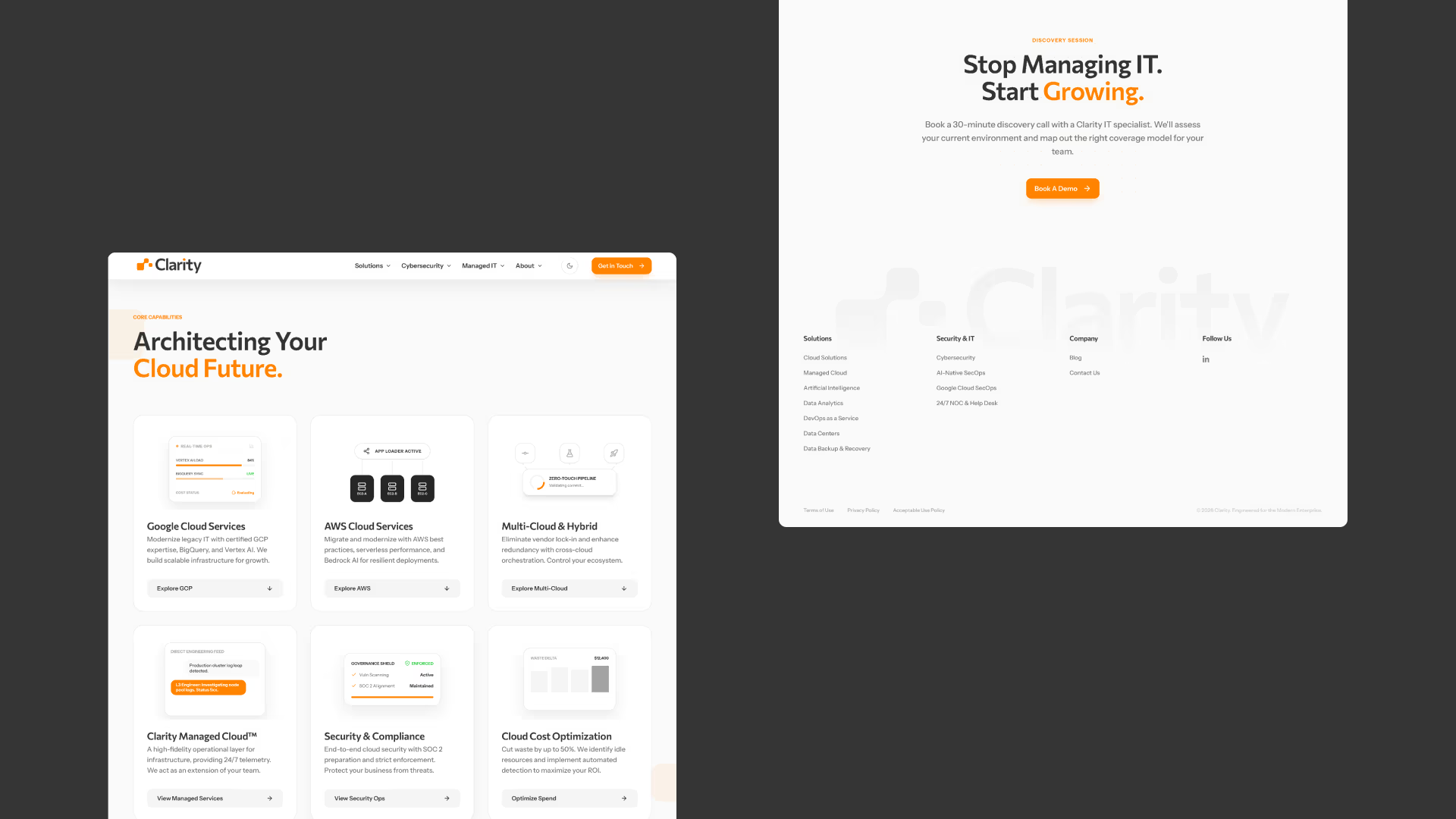
Our objective was to distill a complex service offering into a singular, high-authority visual language. We moved away from the disjointed aesthetics of their past, replacing them with an intentional and cohesive brand system. The centerpiece of this transformation is a unique, abstract brand mark—one that balances technical precision with a forward-thinking perspective. By implementing a “clinical and confident” tone alongside a high-contrast, monochromatic palette, we ensured the identity felt as sophisticated as the enterprise solutions they provide. This wasn’t just a facelift; it was a structural realignment designed to carry the weight of a multi-page global platform.
Summary
Our objective was to distill a complex service offering into a singular, high-authority visual language. We moved away from the disjointed aesthetics of their past, replacing them with an intentional and cohesive brand system. The centerpiece of this transformation is a unique, abstract brand mark—one that balances technical precision with a forward-thinking perspective. By implementing a “clinical and confident” tone alongside a high-contrast, monochromatic palette, we ensured the identity felt as sophisticated as the enterprise solutions they provide. This wasn’t just a facelift; it was a structural realignment designed to carry the weight of a multi-page global platform.
Working with Sean and the team at The Liminals was one of the best experiences we’ve had in redesigning our website.
30%
Generated in YoY revenue
20%
Reduction in page bloat
4x
Faster-to-market
See more
Brand Identity
 Brand Identity