 Brand Identity



For over 10 years, Appleridge Services built an exceptional reputation for reliable, premium property care across the Greater Toronto Area. However, their original digital presence lagged far behind their on-the-ground execution. The legacy website relied on a dated layout, basic typography, and generic industry imagery that failed to reflect the true premium caliber of their work. The objective was to strip away the old, cluttered look and replace it with a clean, high-authority brand identity that builds immediate trust with high-value clients.


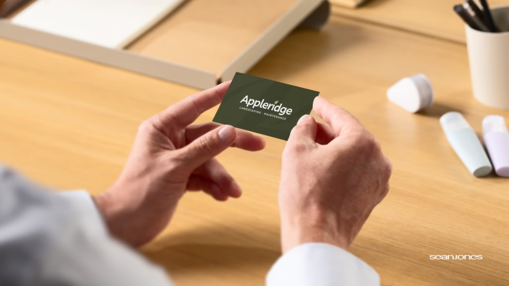
Our approach focused on moving Appleridge away from typical landscaping clichés, such as chaotic visual layouts and generic bright greens, and shifting them toward a concept we call “Grounded Excellence.” We wanted their digital presence to feel just as immaculate and precisely tailored as the physical properties they maintain.
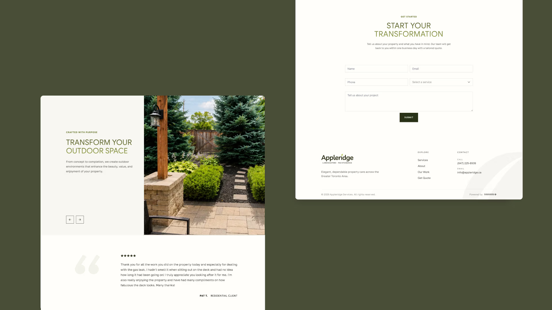
We replaced the previous website’s unstructured look with a highly disciplined visual system. This started with a refined color palette composed of deep forest greens, crisp charcoal tones, and soft natural whites. This premium palette was integrated into a completely overhauled digital framework. The new website trades heavy marketing text for ample white space, strong typographic hierarchy, and elegant architectural photography.
The centerpiece of this transformation is a bold, minimalist brand mark. The custom icon cleanly balances a “Leaf” segment on one side with a stylized “Ridge” on the other, creating a direct and clever connection to the company name. Because of its geometric simplicity, this mark provides excellent versatility, scaling perfectly from high-resolution digital screens to physical applications like business cards and team apparel.
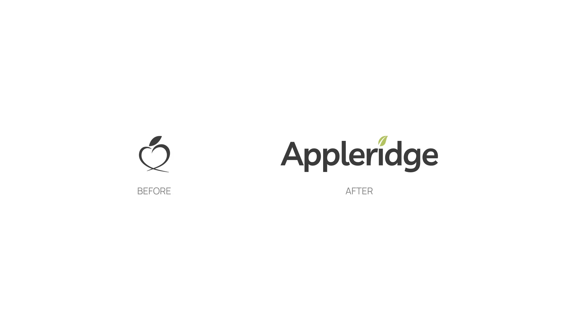
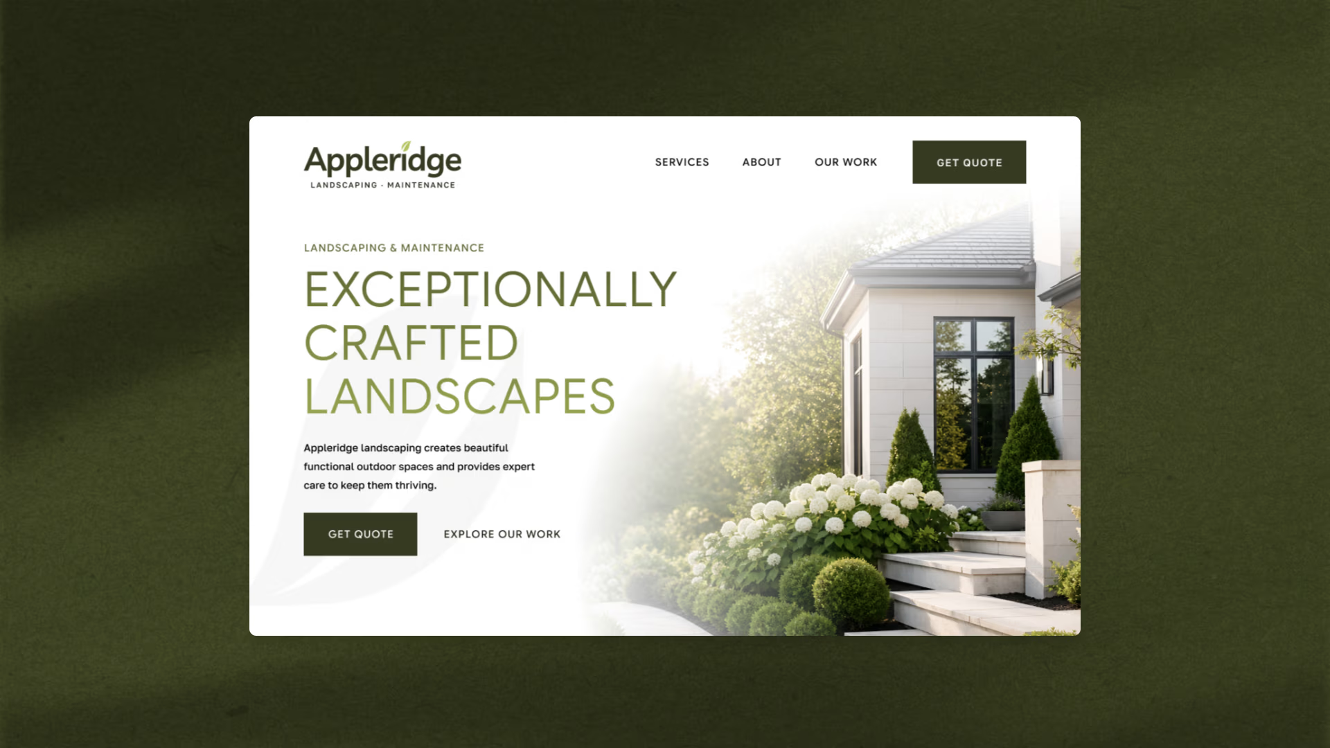

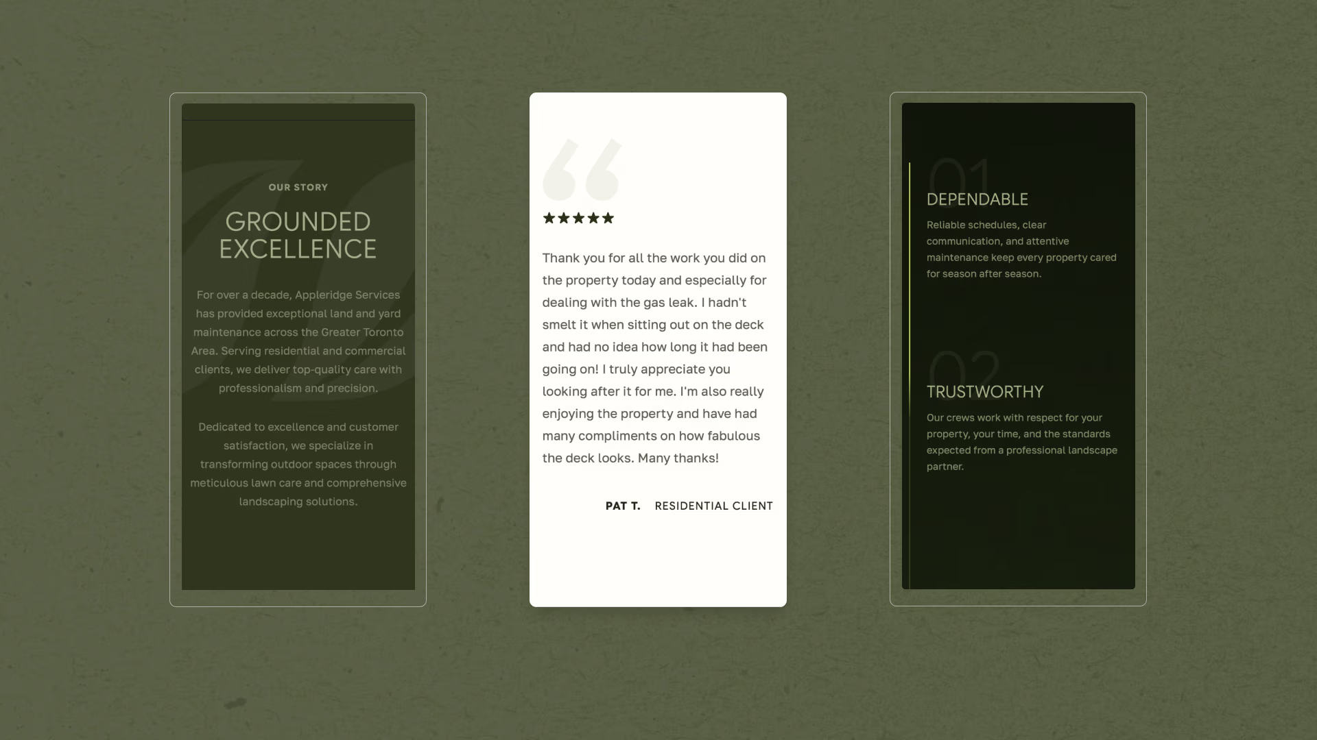

Appleridge Services now possesses a cohesive brand identity and a premium website that accurately commands respect. By fixing their fragmented visual messaging and streamlining the user experience, we transformed their business from a standard local service provider into a definitive leader in their market. The updated framework gives Appleridge the professional weight necessary to attract premium accounts, ensuring that every touchpoint mirrors their 10-year legacy of exceptional craftsmanship.
 Brand Identity
 Brand Identity
